T.L. Hanna High School
Anderson, SC
- [gpimb-btn-addto label="Add to Mood Book" ifnew="Add to Mood Book"]
- [gpimb-btn-view label="View Mood Book" ifnew="View Mood Book"]
Long lines. Boring surroundings. The same old food.
The cafeteria at T.L. Hanna High School in Anderson, South Carolina, was facing an uphill battle in boosting student participation.
Many of the school’s 1,900 students were walking into the dining area at lunch time, heading straight to a table and opening up a bag lunch from home.
The director faced a familiar dilemma — how to get the students motivated to eat in the cafeteria.
The answer was a multi-faceted approach to improving the servery’s function and design, created and brought to life by LTI in partnership with Tom Johnson of Southern Food Equipment Reps.
Improving Function
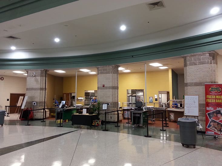
At the heart of the T.L. Hanna cafeteria, the main serving line was a disjointed arrangement of wheeled serving counters, crammed into the space at sometimes odd angles to try to expand serving capacity. Freestanding tables and other temporary solutions had also been added over time to try to improve the flow of students through the line.
“The existing service lines made it difficult to offer all meal options with an appealing presentation,” said Sharon Hunt, director of culinary services for Anderson School District Five, where T.L. Hanna is located.
The school had been working on improving its food offerings to appeal to students, but these enhancements were often lost on a student body that wasn’t interested in standing in long lines during their limited lunch period.
LTI’s renovation of the cafeteria sought to alleviate this issue by adding capacity and improving traffic flow.
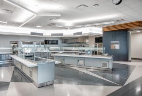
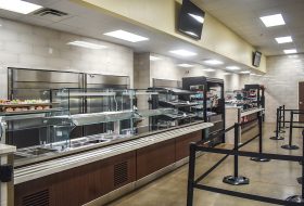
By installing LTI serving line equipment designed for the space, the cafeteria was able to increase the number of available hot and cold food wells and to introduce a dedicated beverage cooler. Previously, drinks had been served out of a cold well, taking space that otherwise could have been used for more food options.
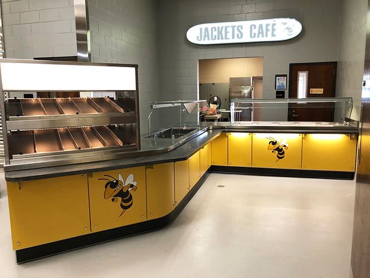
Adding vertical serving options like heated sandwich slides also increased serving capacity and allowed the cafeteria to offer more variety.
A new condiment counter, designed to match the rest of the serving line equipment, was moved outside the primary serving area to prevent slowdowns in the serving line.
Two other existing serving areas — an a la carte station and a devoted pizza area — were upgraded to enhance their capacity and appeal.
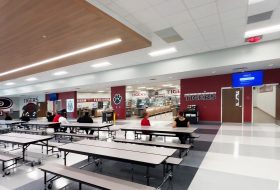
And two new remote kiosk serving areas were constructed in other areas of the dining room to introduce more points of service.
Improving the cafeteria’s flow and function helped alleviate the long lines that had previously deterred students from eating there. But there was still work to be done.
Improving Design
Students accustomed to modern fast casual restaurants and food courts craved a higher-end café feel at school, rather than a staid, institutional cafeteria.
Prior to the renovation, the walls behind the serving line were painted the school’s primary gold color, but no other adornment was in place to make the space appealing.
The updated design, which was carried throughout the space in various ways, drew on the school’s Yellow Jackets mascot and school colors.
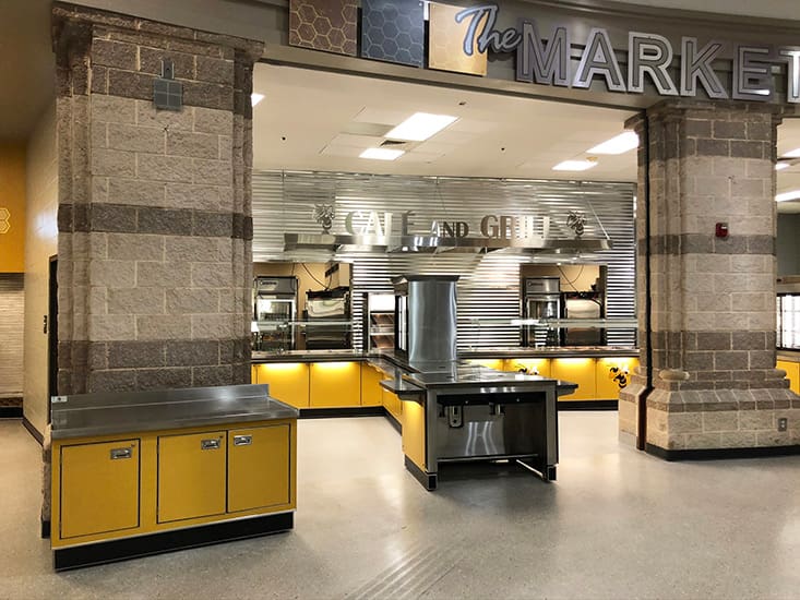
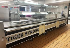
The main serving line received a fresh look with gold, mascot-emblazoned panels on the counter fronts, modern signage and metal designed accents throughout.
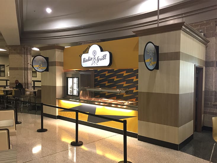
Each of the newly introduced kiosk areas was given its own school-centric brand: Queen’s Corner (a continued Yellow Jacket reference) and Radio Grill, in honor of the legendary James “Radio” Kennedy, a longtime fixture at the school and subject of the 2003 film “Radio.”
Both of these “outposts” were meticulously designed to both stand out with unique branding and décor and also to blend in with their surroundings, as if they’d been there the entire time. For instance, laminate sides were carefully matched to existing stone columns in color and striping.
The existing a la carte area was nearly hidden to the side of the main serving area. Poorly signed, it wasn’t completely clear that it was even a food station.
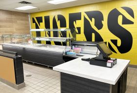
LTI proposed a rebranding as “Hanna Hive.” A new serving counter was installed and highlighted by a custom lighted sign and honeycomb graphics.
A second side area that focused on pizza was also not terribly appealing, outfitted with only a mobile cart. The area was completely updated and given its own branding — Jackets Café.
A new serving line dramatically expanded the serving capacity and was outfitted with appealing touches, including LED lighting, signage and rounded corners on the tray slides for a finished, high-end look.
The overall result of the multi-phase renovation was nothing short of a dramatic transformation.
“Everything about the cafeteria’s function is improved now,” Hunt said. “The presentation of the food is much better. The line moves quickly. And we can serve more students in a better, more appealing way day in and day out.”
